Opus-Space
Technologies Used:
- Fullpage.js
- Three.js
- jQuery
- GSAP
- Figma
Skills Shown:
- Frontend Development
- Quality Assurance
- Version Management
Project Overview
In this 5 person team project, I was one of two developers tasked with building out a single-page website based on a prototype generated by our 2 designers. Our QA Team Lead would then conduct quality-assurance tests and address any issues identified during testing. My primary task was to implement several interactive elements on the site, including a 3D animated landing page sequence.

Design
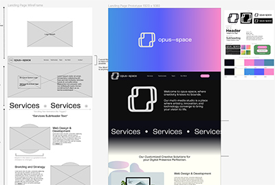
Our design team generated a prototype in Figma for a fictional multimedia company called Opus-Space. The other team members submitted design reviews, addressing a few inconsistencies and omissions. The team met briefly to discuss solutions, and a revised prototype was provided the following day. The animation design was left mostly up to me - the designers only provided an end state.
The design included other animated and interactive elements as well, including a 'news ticker' style animation and a carousel showing all of the team members. We had decided to use Fullpage.js to create smoothly scrolling sections, so it would be my job to implement that as well.

Development
I began by implementing Fullpage.js and creating the sections as specified in the prototype. I created variables for the color palette specified in the style guide and installed the custom fonts chosen by the design team. At this point I handed website development off to my co-developer Sharif, who would be taking care of most of the content and styling while I handled the interactive elements.

3D Animation
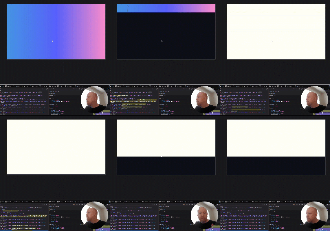
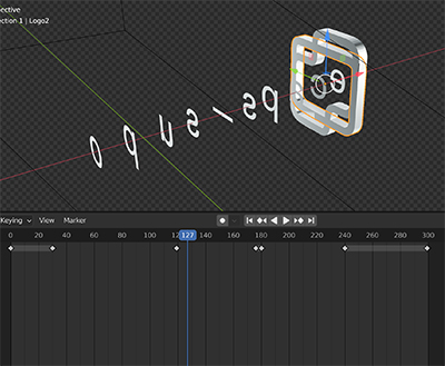
The first interactive element I would build was the landing page animation. I extruded the logo design in Blender3D to make a three dimensional version, and experimented with different types of movement to get ideas for the animation. I found that by rotating the 2 parts of the logo against each other on 2 axes, a gyroscope-like effect was achieved. After some experimentation and sharing several GIFs on the team Discord, we settled on an animation that would have the logo cross the screen, revealing the logo text as it crossed.
After sequencing the keyframe animation in Blender, I exported the animated scene as a GLB file. Using high-level API Three.js, I would write the code necessary to display and animate my graphic in a web browser. Three.js leverages the user's GPU to render 3D scenes via WebGL. I wrote code blocks to create camera, lighting, time clock and to load the model. An orthographic camera was required so that the 2 dimensional letters would be invisible when rotated 90 degrees to the camera angle.

Other Features
I was able to create the designer's 'news ticker' idea using a combination of solutions I found on CodePen. I created the scrolling effect with only CSS, but there was no way to rectify the screen-wide gap before the text repeats. With a small amount of JavaScript, I was able to create an infinitely scrolling banner with no gap.
For the team carousel, I added the GSAP animation library and wrote a couple of simple functions to call when the arrow icons are clicked. I used conditional statements in my functions to have the carousel return to the first slide after scrolling to the end, and vise-versa. I also referenced a variable to the length of the card array, so that scrolling would behave the same if more cards were added to the array.


